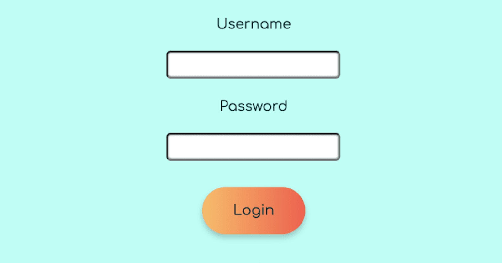
We'll use a shifting background gradient, a simple transform: translate animation, and a button styled like text.
I've been reading up on design principles for web projects. For my last big project, Gachasphere, I wanted to implement hierarchical buttons. So I made 3 button styles to apply across the site: primary, secondary, and tertiary.
I wanted the primary button to be used for calls to action and "dangerous" actions like delete. Ideally, it would be one of the first things a user's eye would be drawn to.
My goal for the secondary button was to make it easier to find than a tertiary button, but not as noticeable as the primary button. It would be used for things like navigation within a page and expanding components.
For the tertiary button, users should be able to find it and tell it's clickable, but it shouldn't pull focus. It would be used for the optional links and in our nav bar when we needed a button instead of a link.
All you need is an HTML <button> tag.
Primary
I know I want my attention grabbing button to be round and a little fat with a box-shadow:, so we'll start with those declarations. Also, we'll give it a margin, align the text in the center, and remove its border. In this case, the text color is the color I used for primary-level text across the site.
.primary-button {
  margin: 20px;
  padding: 15px 35px;
  text-align: center;
  box-shadow: 0 4px 6px 0 hsla(0, 0%, 0%, 0.2);
  border-radius: 30px;
  border: none;
}
Next, the gradient. We're oversizing the background so we can shift it on hover and click. For this project, I had two logos to pull colors from, and luckily they contrasted. So our primary button will be a red, yellow, and orange gradient on a blue background and that will really pop! Add the following to your .primary-button rule-set.
background-size: 200% auto;
color: #083136;
background-image: linear-gradient(
  to right,
    #ffbc5b 0%,
    #ff5645 50%,
    #f7213d 50%,
    #dd07b7 100%
  );
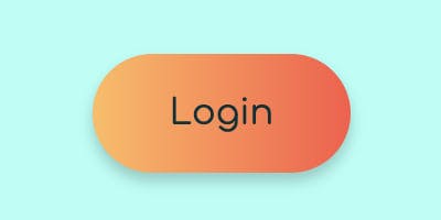
That should give you this:
Then, the hover effect. Add this to your .primary-button rule-set:
transition: 0.5s;
And add two new rule-sets. One to shift the colors on hover/focus:
.primary-button:hover,
.primary-button:focus {
  background-position: right center;
  outline: none;
}
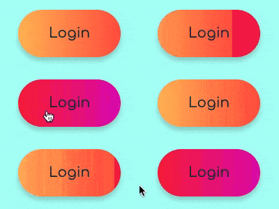
Which should give us this:
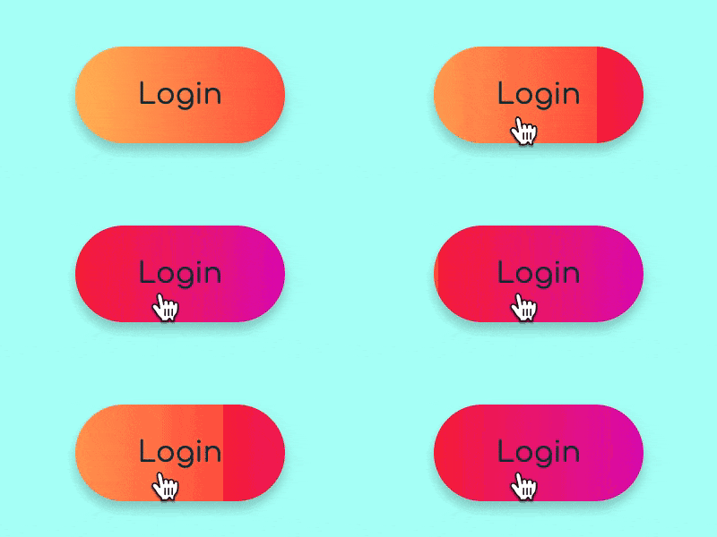
The second declaration will shift the color back on click:
.primary-button:active,
.primary-button:active:after {
  outline: none;
  background-position: left center;
}
Which should look like this:
Both include the outline: none; declaration, which will prevent the default blue focus outline provided by the <button> tag for accessibility purposes.
Secondary
I wanted my secondary button to be a sibling not a twin to my primary button. So it'll have slightly less padding, but the same border-radius and box-shadow. The gradient colors I've picked are closer to (or the same as) the background colors I'm working with. In this case, the text color is the color I used for secondary-level text across the site. The rule-set should look like this:
.secondary-button {
  border-radius: 30px;
  padding: 10px 30px;
  margin: 20px;
  border: none;
  color: #07373b;
  background-image: linear-gradient(
    to right,
    #e8fffb 0%,
    #85fff1 40%,
    #47d4e5 100%
  );
}
Which will give you this:

Finally, we'll add a slightly different click animation, using transform: translate with a new rule-set. Now, the button will move 3px on the x-axis and y-axis when it's clicked- some nice visual feedback for the user.
.secondary-button:active {
  transform: translateY(3px) translateX(3px);
}
Which should give you:
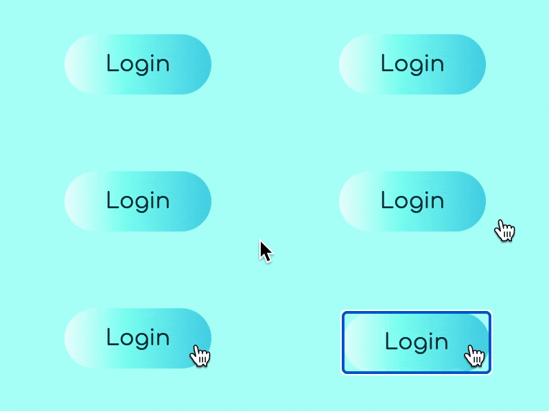
The text color has a high enough contrast with the background, so the cursor is probably enough… but because the button colors include the background colors, I've left the focus outline on.
Tertiary
Finally, the forgettable button. The styling will look just like text. The cursor changing shows it's clickable (and it will still be focusable by a keyboard user and semantic for a screenreader thanks to the <button> tag). In this case, the text color is the one I was using for tertiary-level text across the site.
.tertiary-button {
  border: none;
  color: #0d5059;
  background-color: #adfff5;
  padding: 20px;
}
Put it all together and they look like this:
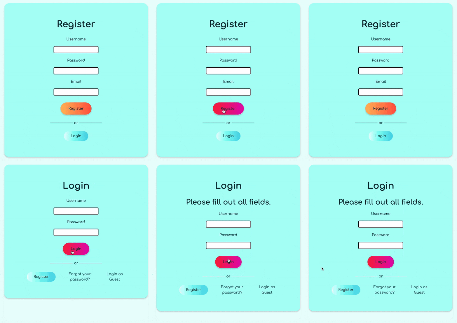
A clear hierarchy! Pretty obvious the login button is a call to action. The next button that your eye moves to navigates you to the register page instead of the login page. The "forgot password" and "login as guest" options are easily found, but don't pull focus.
Conclusion
Hopefully you got a little insight into my thought process for designing buttons with a clear hierarchy. I really love the shifting background gradient effect. More importantly, understanding simple translation animations and how to style buttons like text are very useful skills.
Check out these buttons live at Gachasphere (and its Github repo). Tag me on Twitter or Github if you use the buttons! If you enjoyed this tutorial or are left with questions, leave a com

