Read Part 1 - The Audit, Part 2 - Quick Fixes, and Part 3 - Dark Mode Toggle.
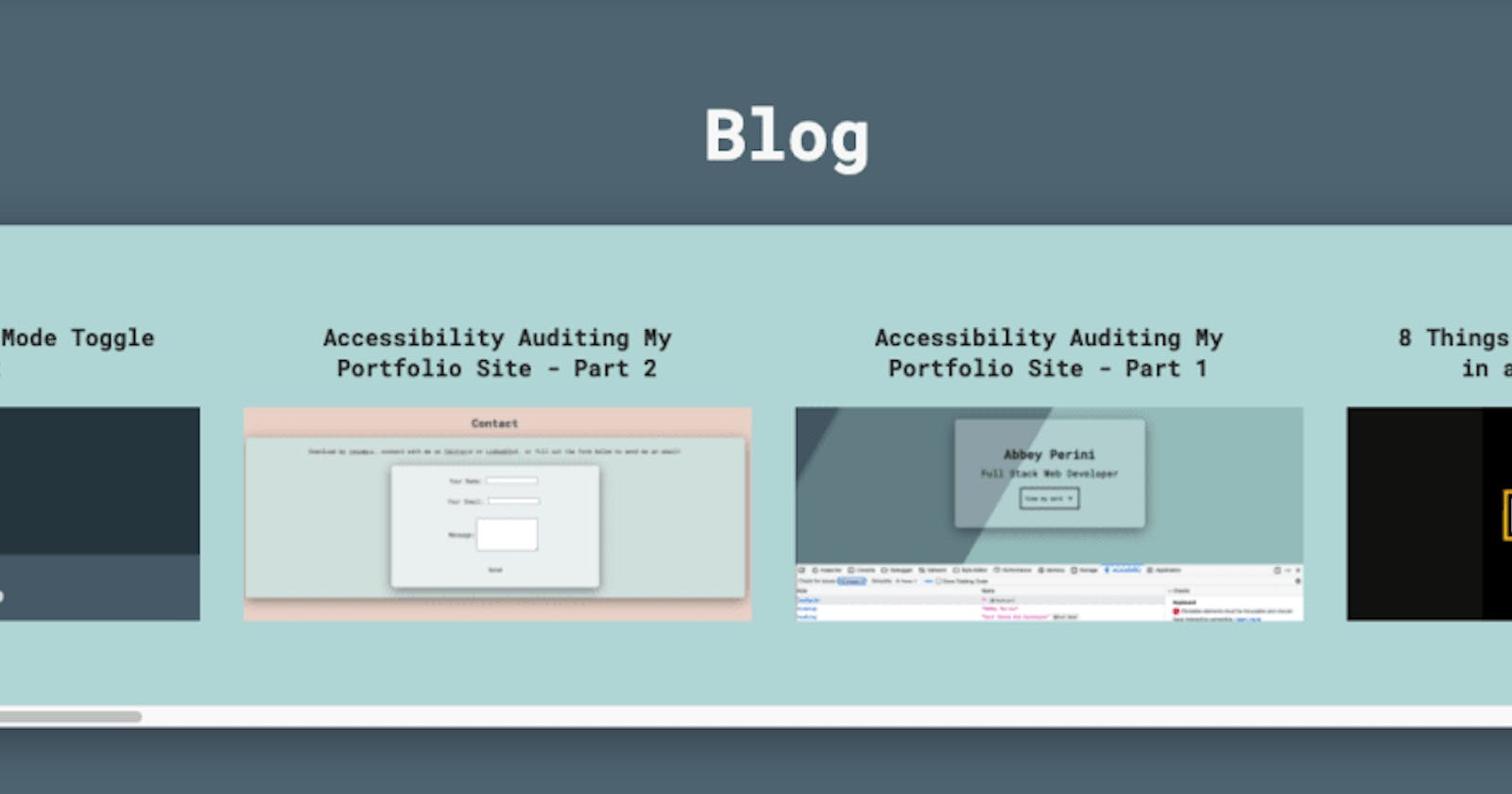
This blog will focus on making the blog preview component code on the main page of my site more accessible.
The Problems
First, I want to update the blog preview component to always return a <section> and <h1>. Currently, the error or loading text is returned with just a Shiba Inu SVG. Also, I need revisit the CSS so this component is uniform with the rest of the site.
Next, the individual blog previews within the component aren't focusable when you're using a keyboard. Once I've made the previews focusable, keyboard and screenreader users need to be able to scroll horizontally... without getting trapped.
Finally, when I was manually testing, I noticed that it wasn't obvious to a screenreader that you can interact with each blog preview heading. Luckily, the answer to this may also be the answer to making the previews focusable.
Uniformity, but with Meaning
This is the easiest to do, and requires my lambdas to be off, so I'm starting here. I import Error and Loading components into my blog preview component, so I'll need to add the <section> and <h1> within them. To maintain functionality, I also had to pass down my chooseComponent function in props.
For example, my Error component now looks like this:
function Error(props) {

  const chooseComponent = (component) => {
    props.chooseComponent(component);
  }

  return (
    <section className="container_blog">
      <h1 aria-label="button to open full blog page" ><button className="blog-section_title" onClick={() => chooseComponent("FullBlog")}>Blog</button></h1>
      <div className="container_error">
        <ConfusedShiba className="error-graphic"/>
        <p>There was an error! Try again later.</p>
      </div>
    </section>
  )
}

export default Error
Now for the CSS! Getting the font size of the "Blog" button/heading the same as the other sections only required changing the value of the font-size property in my .blog-section_title rule to 1.5em.
Next, I want the spacing between the headings and content containers to be more uniform. Plus I want the Error and Loading components to always be the same width as the rest of the sections. I revisited all of my media queries, adjusting margin and width properties.
Finally, I set up my local lambda server so I can verify that the spacing of the blog preview component still looks correct. The width is a little off, so I go through all my media queries again and find a couple spots where the heading spacing needed to be tweaked too.
Totally Tabbular
The first thing I want to try is putting my preview headings in a <button> instead of just in an <h2> with an onClick handler. I suspect this will also make it more obvious to a screenreader that they are interactive.
Adding the <button> does make it focusable, but I end up removing the <h2> entirely. Now, the screenreader I'm testing with clearly states the title of the blog, that you're on a button, the item number, and how many items there are in the list when you focus on a blog title. The structure of the individual blog previews now looks like this:
return (
  <li key={blog.id} className="preview">
    <button className="preview_button" onClick={() => chooseComponent({id: blog.id})}>{blog.title}</button>
    <img className="preview_image" alt={altText} src={blogImage}></img>
  </li>
)
Honestly, I have no idea why I didn't just use a <button> in the first place. I mean, the CSS class is called preview_button, for heaven's sake. I would like to say I was focused on heading hierarchy, but I wrapped the "Blog" <button> in an <h1> in Part 2 of this blog series. However, my preview_button rule applies perfectly, including the focus/hover outline:

Horizontal Scrolling
Now that the items are focusable, and you can tell when using a screenreader that you can interact with them, I need to manually test the horizontal scrolling.
The first thing I notice is that it is much easier to avoid having to scroll through the entire list of blog previews on a screenreader. The second is that I need to set alt-text="" on all of the cover images, so the screenreader will skip over them. Hearing both the heading text and cover image alt-text becomes very repetitive. Plus, one could say the cover images are decorative. This will also solve a warning I got about one of the cover images having alt-text longer than 150 characters.
Next I add aria-label="previews of Abbey's blog posts" to the <ul> that holds all of my blog preview <li>s:
return (
  <section aria-label="Blog Previews" className="container_blog">
    <h1 aria-label="button to open full blog page" ><button className="blog-section_title" onClick={() => chooseComponent("FullBlog")}>Blog</button></h1>
    <div className="scroll-cropper">
        <ul aria-label="previews of Abbey's blog posts" className="blog-preview">
          {blogPreviewList}
        </ul>
    </div>
  </section>
)
Now instead of just "list," the screenreader I am using says "list preview of Abbey's blog posts." At this point, keyboard navigation is working fine, if a bit lengthy, and navigating this component with a screenreader makes much more sense.
It's Not a Trap!
Turns out, I had no idea what a keyboard trap was! As long as the user can escape the component using just the keyboard or screenreader and not a mouse, it's ok! Very glad this component passes the test. I'll be doing some more research on skip links for the next blog post. I may add one in here as this 19 item list is only growing with every blog post I write. Up until this point, I haven't been adding any because a user would only have to tab through the navigation bar to hit the main content. Plus, the navigation bar buttons load single sections, allowing a user to skip directly to what they want to read.
Conclusion
That's an audit, some quick fixes, and 2 problematic components down - one massive blog styling revamp to go! I am quite relieved this component was so easily fixed.
Read Part 5 - Blog Page Accessibility Deep Dive
In which I find a security vulnerability, write a surprising number of regexes, and this series becomes a thesis.

